I have a fairly large header that I'm managing via:
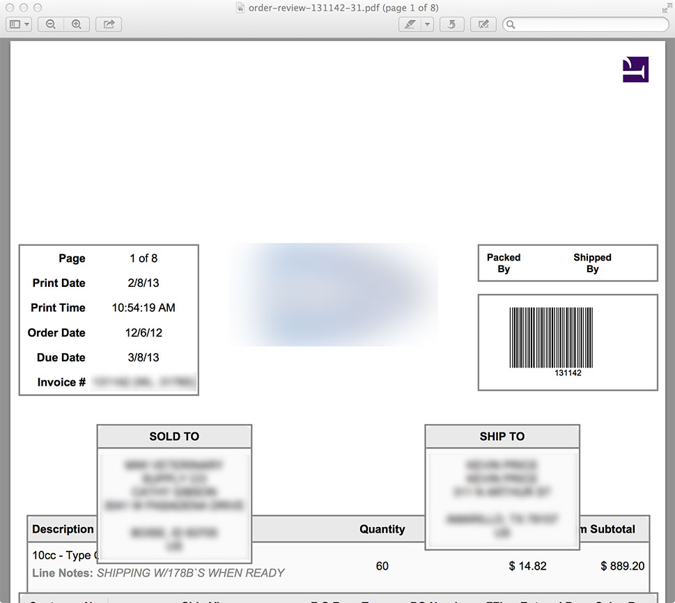
This is the result:
If I don't add the large margin, the header gets cut off. If I add the large margin, it shows the whole header, but adds a huge gap at the top (shown above).
What can I do to fix this?
	@page {
		size: US-Letter portrait;
		margin-top: 6in;
		margin-left: 0;
		margin-right: 0;
		margin-bottom: .25in;
		@top-center {
			height: 6in;
			margin: 0;
			content: flow(header);
		}
	}

	.prince #backorderHeader {
		flow: static(header);
	}
This is the result:
If I don't add the large margin, the header gets cut off. If I add the large margin, it shows the whole header, but adds a huge gap at the top (shown above).
What can I do to fix this?

